
Hello, everybody! Today, I’ll go over another widget that is unavoidably present in our daily lives, utilizing desktop, online, and mobile technology. This widget is referred to as “tooltips.” and I am going to discuss how to use Material Design Tooltips in Flutter.
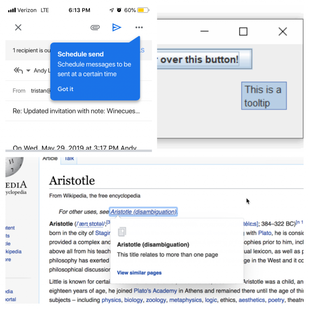
In Addition, A tooltip is a small dialog that appears when you interact with display components and gives you tips about the component, specifically a tool. In contrast, tooltips display informative text when users hover over, focus on, or tap an element. When activated, tooltips display a text label identifying an element, such as a description of its function.
ToolTips Properties
Additionally, A tooltip properties has text label and a container.
- Text label
- Container
Knowing the properties is crucial on how to use material design tooltips in Flutter.
Dos
- Use tooltips for interactive imagery.
- Describe differences between similar elements.
- Distinguish actions with related iconography
- Keep the position of the tooltip visible.
Don’ts
- Don’t use tooltips to restate visible UI text.
- Display shadows on tooltips.
- Display rich information and imagery on tooltips.
- Don’t crop tooltips.
For a vivid dos and don’ts explanation of tooltips, check out the document here: https://material.io/components/tooltips#placement
Theming
Material Theming is supported by tooltips, which can be changed in terms of color, typography, and form.
Use the decoration property to change the background color and shape. The textStyle property can be used to change the typeface, color, and other aspects of the text.
How To Use Material Design Tooltips Source Code
It’s coding time! To use the material design tooltip widget, first create a widget called ToolTip and use the message argument to display your desired tooltip message when the tooltip activates. Then use the child argument to insert your desired icons if you want.
import 'package:flutter/material.dart';

void main() => runApp(MyApp());

class MyApp extends StatelessWidget {
  @override
  Widget build(BuildContext context) {
    return MaterialApp(
      title: 'Tooltip Demo',
      debugShowCheckedModeBanner: false,
      theme: ThemeData(
        tooltipTheme: TooltipThemeData(
          decoration: ShapeDecoration(
            color: Color(0xFF232F34),
            shape: StadiumBorder(),
          ),
          textStyle: TextStyle(color: Colors.white),
        ),
      ),
      home: Scaffold(
        body: Center(
          child: Tooltip(
            message: 'Play',
            child: Icon(Icons.play_arrow),
          ),
        ),
      ),
    );
  }
}
Finally, to apply theming on your material app widget tree, you can use an argument called the theme, and on its ThemeData widget, use another argument called tooltiptheme, and finally, on the TooltipThemeData widget, on its decoration argument, assign any shape decoration widget you want, which is the color and shape property.
Lastly, on the tooltipTheme, apply your desired text color by using an argument called textStyle and creating the textstyle widget with the desired color you want.
Conclusion
To conclude, knowing the properties is crucial to knowing how to use material design tooltips in Flutter. Lastly, on the tooltipTheme, you can actually apply any kind of your desired text color by using an argument called textStyle and creating the textstyle widget with the desired color you want, which is definitely quite significant. Thank you once more for reading. Kindly share this with your friends and family if you find it useful.