
Introduction
Welcome to the world of Snowflake visualizations! In this post, we’ll take you through the steps to create a basic bar chart visualization. Get ready to say goodbye to boring data tables and hello to interactive graphs.
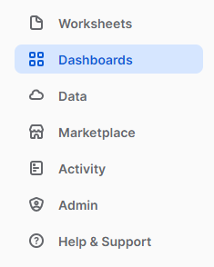
Creating a visualization
First things first, navigate to the dashboard section.
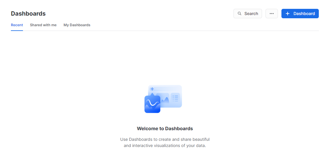
Hit the “+ Dashboard” button and create a new dashboard.
Name it whatever you like and select Create Dashboard.

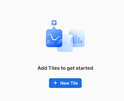
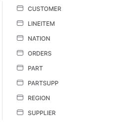
Time to add a new tile. We’ll be working with the Snowflake’s pre-loaded sample data, TPCH_SF100 schema.
Locate the databases on the left and select “SNOWFLAKE_SAMPLE_DATA”.
Within TPCH_SF100, you’ll see tables such as “CUSTOMER” and “ORDERS”.
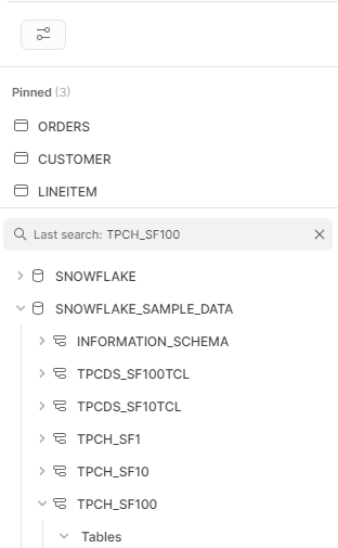
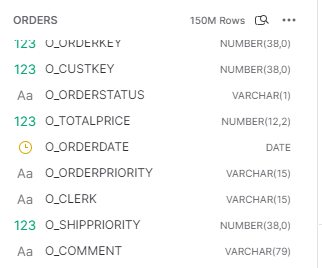
Simply hover over the table and click the “pin” button to see it in the pinned section.
One you click on the table. It will show the details inside them. As you can see it displayed their Unique identifiers.
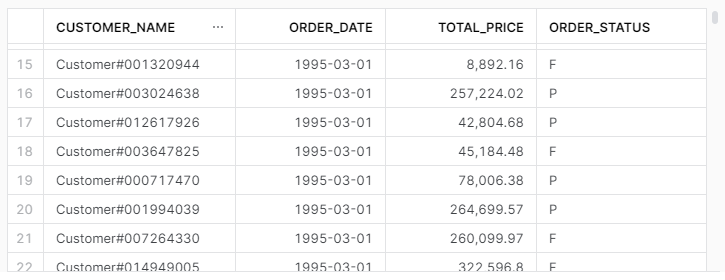
With the table details displayed, run a sample SQL query.
select
    customers.c_name as customer_name,
    orders.o_orderdate as order_date,
    orders.o_totalprice as total_price,
    orders.o_orderstatus as order_status
from
    TPCH_SF100.ORDERS as orders
    left join TPCH_SF100.CUSTOMER as customers on orders.o_custkey = customers.c_custkey
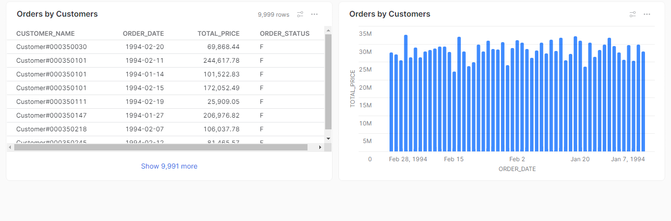
This SQL query retrieves data from the “Orders” and “Customer” tables in the TPCH_SF100 schema in the Snowflake sample data.
The query performs a left join between the “Orders” and “Customer” tables on the “o_custkey” column in the “Orders” table and the “c_custkey” column in the “Customer” table.
The query then selects four columns from the joined table and renamed as customer_name, order_date, total_price, and order_status.
Select the chart icon for data visualization.
Here I have selected the Bar chart type and as you can see the chart displays the total price by each order date.
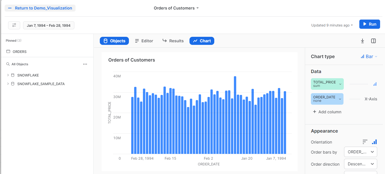
Simply Select the -Return button and it will add the Bar chart visualization as a tile .
You can also add the generated Table as a tile or other visualizations you have created by clicking the + icon.
Conclusion
With just a few clicks, you can transform boring data into visually appealing graphs. Don’t be afraid to get creative and try out different chart types.