
As a back-end guy like me, you’ve probably heard of theming in Flutter, but you’ve probably never even bothered to use it. You’ve probably known a little or two about it, but there’s still that enigma in your mind that you didn’t know deeply about it, or worse, you’ve probably suffered from an imposter syndrome about it when around your co-workers.
That is why today we’re going to dive deep into how to use theming in Flutter, and hopefully after reading this blog our imposter syndrome is gone, assuming you also have it too. No? I guess you’re still suffering from it too. Just kidding, let’s get started!
What is Theming In Flutter
According to this documentation, Themes are used to share colors and font styles across an app. You can either set app-wide themes, or use Theme widgets that define the colors and font styles for a single portion of the application.
After you’ve defined a Theme, you can utilize it in your own widgets. The background colors and font styles for AppBars, Buttons, Checkboxes, and other Flutter widgets are likewise controlled by your Theme.
How to use Theming In Flutter
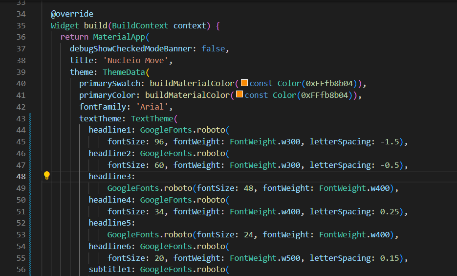
First, you must provide a ThemeData to the MaterialApp constructor to share a Theme throughout an entire app or the default MaterialApp will decide it for you.
MaterialApp(
  title: "My App",
  theme: ThemeData(
    brightness: Brightness.dark,
    primaryColor: Colors.lightBlue[800],
    fontFamily: 'Georgia',
    textTheme: const TextTheme(
      headline1: TextStyle(fontSize: 72.0, fontWeight: FontWeight.bold),
      headline6: TextStyle(fontSize: 36.0, fontStyle: FontStyle.italic),
      bodyText2: TextStyle(fontSize: 14.0, fontFamily: 'Hind'),
    ),
  ),
  home: const MyHomePage(
    title: "My App",
  ),
);
In contrast, there’s a circumstance where only a certain part of the Widget that we want a custom Theme on it rather than using the parent Themedata. In that case, you must wrap that certain Widget with a Theme Widget and, on its data statement, pass a ThemeData with your desired theme on it.
Theme(
  data: ThemeData(
    splashColor: Colors.yellow,
  ),
  child: FloatingActionButton(
    onPressed: () {},
    child: const Icon(Icons.add),
  ),
);
If you found overriding everything difficult, you could just copy a certain statement from the parent ThemeData like the code below.
Theme(
  data: Theme.of(context).copyWith(splashColor: Colors.yellow),
  child: const FloatingActionButton(
    onPressed: null,
    child: Icon(Icons.add),
  ),
);
Now that you’ve defined a theme, you may utilize it in the widgets’ build() functions by calling Theme.of(context).
The Theme.of(context) method searches the widget tree for the closest Theme in the tree and returns it. If you have a standalone Theme defined above your widget.
Container(
  color: Theme.of(context).colorScheme.secondary, // Usage here
  child: Text(
    'Text with a background color',
    style: Theme.of(context).textTheme.headline6,
  ),
),
Additionally, you could check some fonts here if you want to know what it would look like before applying those fonts to your app.
Conclusion
To summarize, We have learned how to use theming in Flutter. You must provide a ThemeData to the MaterialApp constructor to share a Theme throughout an entire app, or the default MaterialApp will decide it for you. After you’ve defined a Theme, you can utilize it in your own widgets. Thank you for reading. If you found this useful, please share it with your family, friends, or co-workers. Until next time.