
Bootstrap is an open-source CSS framework, and it is free. It includes design templates for typography, forms, buttons, navigation, and other interface elements that are based on HTML, CSS, and JavaScript. By that, they also provided basic colors in order for the developers to manage the design of their work.
Wikipedia
Here’s the list of some basic colors and their keyword/code in Bootstrap that you can use:
– Blue (-primary)
– Danger (-danger)
– Yellow (-warning)
– Green (-success)
– Gray (-secondary)
– Black (-dark)
– White (-light)
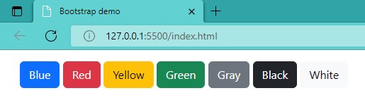
Some Examples of How to Use Some Basic Bootstrap Colors
<button type="button" class="btn btn-primary">Blue</button>
<button type="button" class="btn btn-danger">Red</button>
<button type="button" class="btn btn-warning">Yellow</button>
<button type="button" class="btn btn-success">Green</button>
<button type="button" class="btn btn-secondary">Gray</button>
<button type="button" class="btn btn-dark">Black</button>
<button type="button" class="btn btn-light">White</button>
Here’s the link of the code above: Buttons · Bootstrap v5.2 (getbootstrap.com)
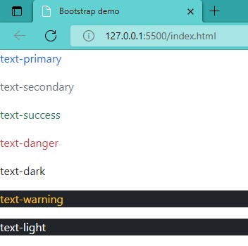
<p class="text-primary">.text-primary</p>
<p class="text-secondary">.text-secondary</p>
<p class="text-success">.text-success</p>
<p class="text-danger">.text-danger</p>
<p class="text-dark">.text-dark</p>
<p class="text-warning bg-dark">.text-warning</p>
<p class="text-light bg-dark">.text-light</p>
Here’s the link of the code above: Colors · Bootstrap v5.2 (getbootstrap.com)
For more information, just go to the Bootstrap website:
https://getbootstrap.com/docs/5.2/utilities/colors/#colors
I hope this was helpful. Thank you very much!