
Today’s topic is about how to make adaptive apps in Flutter. Fundamentally, adaptive and responsive design are two techniques for designing for a wide range of devices. In its most basic form, responsive design employs a single layout and adjusts the page’s text, navigation, and elements to match the user’s screen. When viewed on a desktop, laptop, tablet, or mobile phone, the responsive design will reconfigure all design elements. Different fixed layouts are built using adaptable designs that adapt to the user’s screen size. Unlike the more fluid, responsive method, adaptive design makes use of several sizes of a fixed design.
Responsive Apps Design
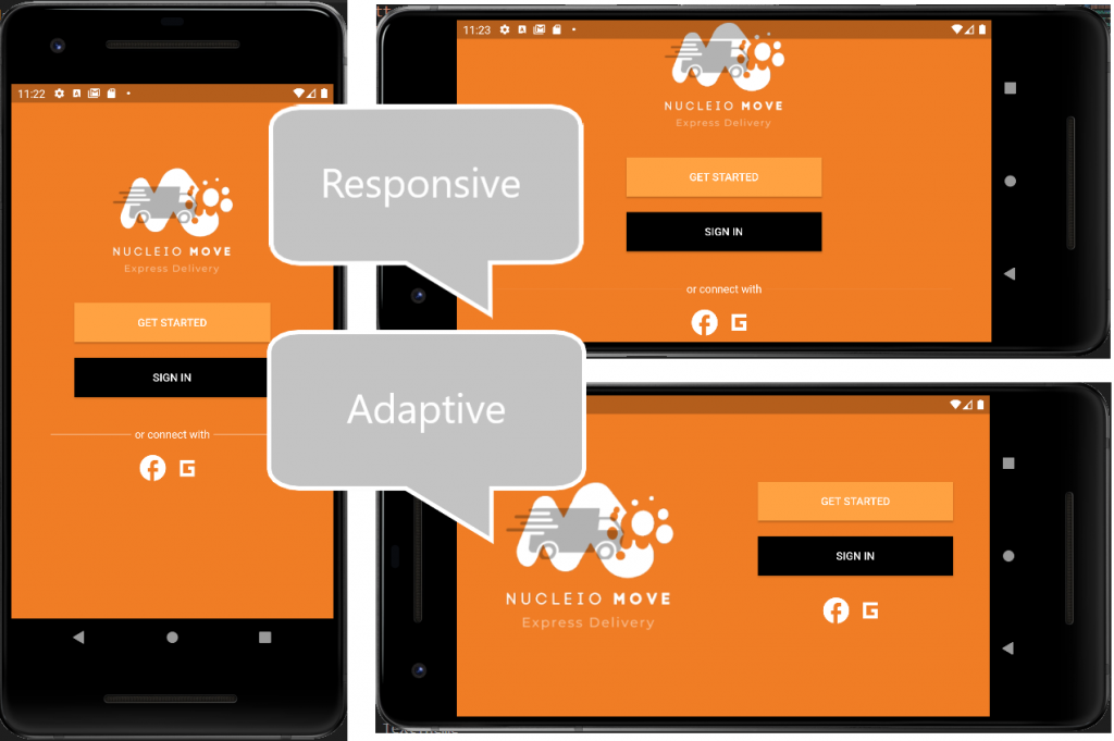
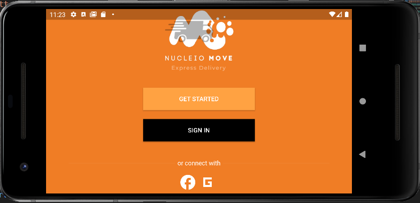
Furthermore, as some of you may have noticed, wrapping your Parent Widget in LayoutBuilder and SingleChildScrollView, as shown in the image below, will make your Flutter App responsive. This is probably the easiest way to make your app responsive as such other ways can be achieved using MediaQuery as others prefer to use.
This can be achieved with the following code:
body: LayoutBuilder(
        builder: (BuildContext context, BoxConstraints constraints) {
          return SingleChildScrollView(
            child: ConstrainedBox(
              constraints: BoxConstraints(
                minHeight: constraints.minHeight,
              ),
              child: Center(
                child: Column(
                  children: [
                    const SizedBox(height: 100),
                    SizedBox(
                        height: 150,
                        child: Image.asset('images/LandingPage_Logo.png')),
                    const SizedBox(height: 30),
                    ElevatedButton(
                      style: ElevatedButton.styleFrom(
                        primary: const Color(0xFFffa242),
                        minimumSize: const Size(250, 50),
                        shape: const RoundedRectangleBorder(
                          borderRadius: BorderRadius.zero,
                        ),
                      ),
                      onPressed: () {
                        Navigator.of(context).push(
                          MaterialPageRoute(
                            builder: (BuildContext context) =>
                                const SignUpScreen(),
                          ),
                        );
                      },
                      child: Text(
                        'Get Started'.toUpperCase(),
                        style: const TextStyle(color: Colors.white),
                      ),
                    ),
                    const SizedBox(height: 20),
                    ElevatedButton(
                      style: ElevatedButton.styleFrom(
                        primary: Colors.black,
                        minimumSize: const Size(250, 50),
                        shape: const RoundedRectangleBorder(
                          borderRadius: BorderRadius.zero,
                        ),
                      ),
                      onPressed: () {
                        Navigator.of(context).push(
                          MaterialPageRoute(
                            builder: (BuildContext context) =>
                                const SignInScreen(),
                          ),
                        );
                      },
                      child: Text(
                        'Sign In'.toUpperCase(),
                        style: const TextStyle(color: Colors.white),
                      ),
                    ),
                    const SizedBox(height: 30),
                    Row(children: <Widget>[
                      Expanded(
                        child: Container(
                          margin: const EdgeInsets.only(left: 50.0, right: 5.0),
                          child: const Divider(color: Colors.white, height: 36),
                        ),
                      ),
                      const Text("or connect with",
                          style: TextStyle(color: Colors.white)),
                      Expanded(
                        child: Container(
                          margin: const EdgeInsets.only(left: 5.0, right: 50.0),
                          child: const Divider(color: Colors.white, height: 36),
                        ),
                      ),
                    ]),
                    Row(
                      mainAxisAlignment: MainAxisAlignment.center,
                      crossAxisAlignment: CrossAxisAlignment.center,
                      children: <Widget>[
                        Icon(
                          Icons.facebook,
                          color: Colors.white,
                          size: 40,
                        ),
                        Icon(
                          Icons.g_mobiledata_sharp,
                          color: Colors.white,
                          size: 50,
                        ),
                      ],
                    ),
                  ],
                ),
              ),
            ),
          );
        },
      ),
Adaptive Apps Design
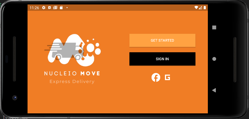
In contrast, sometimes we just don’t like our app deciding on its own responsive view. We prefer to customize it. That’s where adaptive design comes into play. As shown in the image below, the design has its own ways of presenting itself in a landscape view. Additionally, you may check the code below.
To demonstrate, the code below still utilizes the LayoutBuilder since it needs to know the max width of the container from the constraints parameter, so it can identify the orientation of the device by the conditional operator if the constraint’s max width returns true when the max width is greater than 600.
Consequently, if it was indeed on landscape view, the conditional operator would return the wide container widget and then the normal container on the latter.
body: LayoutBuilder(
        builder: (context, constraints) {
          if (constraints.maxWidth > 600) {
            return _buildLandscapeView(context, constraints);
          } else {
            return _buildPortraitView(context, constraints);
          }
        },
),
Widget _buildPortraitView(context, constraints) {
return Container(
width: double.infinity,
height: double.infinity,
child: Stack(
children: [
Image.asset(
'images/googlemapdummy.png',
fit: BoxFit.fill,
width: double.infinity,
height: double.infinity,
),
Positioned(
left: constraints.maxWidth * 0.01,
bottom: constraints.maxHeight * 0.01 - 30,
child: UserFloatingPanel(
username: "John Doe",
userlevel: "Basic Level",
userearnings: 1250.00,
subtext: "Earned"),
),
],
),
);
}Widget _buildLandscapeView(context, constraints) {
return Container(
width: double.infinity,
height: double.infinity,
child: Stack(
children: [
Image.asset(
'images/googlemapdummy.png',
fit: BoxFit.fill,
width: double.infinity,
height: double.infinity,
),
Positioned(
left: constraints.maxWidth * 0.2,
bottom: constraints.maxHeight * 0.01 - 30,
child: UserFloatingPanel(
username: "John Doe",
userlevel: "Basic Level",
userearnings: 1250.00,
subtext: "Earned"),
),
],
),
);
}Conclusion
To conclude, adaptive design employs multiple sizes of a fixed design. The responsive design will reconfigure all design elements regardless of whether they’re viewed on a desktop, laptop, tablet, or mobile phone. In the simplest terms, responsive design means adjusting the content, navigation, and elements of the page to fit the user’s screen. I demonstrated how to do so on Flutter by separating different views in a widget container and using the LayoutBuilder. You can also read this interesting article to dive deeper into their differences. That’s all for now on How To Make Adaptive Apps In Flutter. Thank you for reading. If you found this useful, please share it with your family and friends. Good bye.