

Most apps have a menu, and the most convenient design for a menu is on the side of an app, which is called DrawerMenu, and today I am going to show you on this blog how to implement it in your Flutter App. Let’s get started!
Implementation
For demonstration, I am going to implement the DrawerMenu in my app source code below.
//main.dart
import 'package:my_flutter_app/DrawerMenu.dart'; // don't forget to import your custom widget

class MyApp extends StatefulWidget {
  const MyApp({Key? key}) : super(key: key);

  @override
  State<MyApp> createState() => _MyAppState();
}

class _MyAppState extends State<MyApp> {
  int currentIndex = 0;

  @override
  Widget build(BuildContext context) {
    return MaterialApp(
      debugShowCheckedModeBanner: false,
      home: Scaffold(
        appBar: AppBar(
          title: Row(children: const [Text("My Flutter App")],),
          backgroundColor: const Color(0xFFfb8b04),
        ),
        drawer: const DrawerMenu(), // Added DrawerMenu
        body: Center(
          child: currentIndex == 0
              ? const BodyImageWidget()
              : currentIndex == 1
                  ? MyCards()
                  : currentIndex == 2
                      ? const MyTextBody()
                      : const ButtonChange(),
        ),
        bottomNavigationBar: BottomNavigationBar(
          type: BottomNavigationBarType.fixed,
          items: const [
            BottomNavigationBarItem(
              label: "Home",
              icon: Icon(Icons.home),
            ),
            BottomNavigationBarItem(
              label: "Quotes",
              icon: Icon(Icons.book),
            ),
            BottomNavigationBarItem(
              label: "Texts",
              icon: Icon(Icons.text_fields_sharp),
            ),
            BottomNavigationBarItem(
              label: "Button",
              icon: Icon(Icons.radio_button_checked),
            )
          ],
          currentIndex: currentIndex,
          onTap: (int index) {
            setState(() {
              currentIndex = index;
            });
          },
        ),
      ),
    );
  }
}
As you can see, I added a new argument called “drawer” and assigned a custom widget called “DrawerMenu”. Of course, don’t forget to import it if it was a separate widget “.dart” file.
Usage
You may have noticed that the DrawerMenu was on a separate widget dart file. Check the code below and I’ll explain further.
// DrawerMenu.dart

import 'package:flutter/material.dart'; // don't forget to import this

class DrawerMenu extends StatefulWidget {
  const DrawerMenu({Key? key}) : super(key: key);

  @override
  State<DrawerMenu> createState() => _DrawerMenuState();
}

class _DrawerMenuState extends State<DrawerMenu> {
  @override
  Widget build(BuildContext context) {
    return Drawer(
      child: ListView(
        padding: EdgeInsets.zero,
        children: [
          DrawerHeader(
            decoration: BoxDecoration(
              color: Colors.orangeAccent,
            ),
            child: Row(children: [Image.asset('images/useravatar.png', width: 50,),SizedBox(width: 10,),Text('Welcome User!', style: TextStyle(color: Colors.white, fontSize: 20),),],),
          ),
          ListTile(
            leading: Icon(Icons.settings),
            title: const Text('Settings'),
            onTap: () {
              Navigator.pop(context);
            },
          ),
          ListTile(
            leading: Icon(Icons.logout),
            title: const Text('Logout'),
            onTap: () {
              Navigator.pop(context);
            },
          ),
        ],
      ),
    );
  }
}
As you can see, the drawer widget was the parent tree of this DrawerMenu widget. The Drawer widget consists of ListView, DrawerHeader, and ListTiles.
You can design it on your own, of course, but in my case, I made the DrawerHeader color orange and it has a child row widget that also has a child image for my user avatar, SizedBox for spacing, and Text for welcoming the user.
On the other hand, I implemented an icon on my ListTile widget and the argument for that was not an “icon” argument but it’s called the “leading” argument, and finally, worth mentioning is the onTap argument, where you must implement the line of code “Navigator.pop (context)” as it will hide the DrawerMenu after selecting an item on the DrawerMenu. Of course, you are free to not implement it, but it is a common operation where a DrawerMenu hides after a user selects an operation on the ListTile.
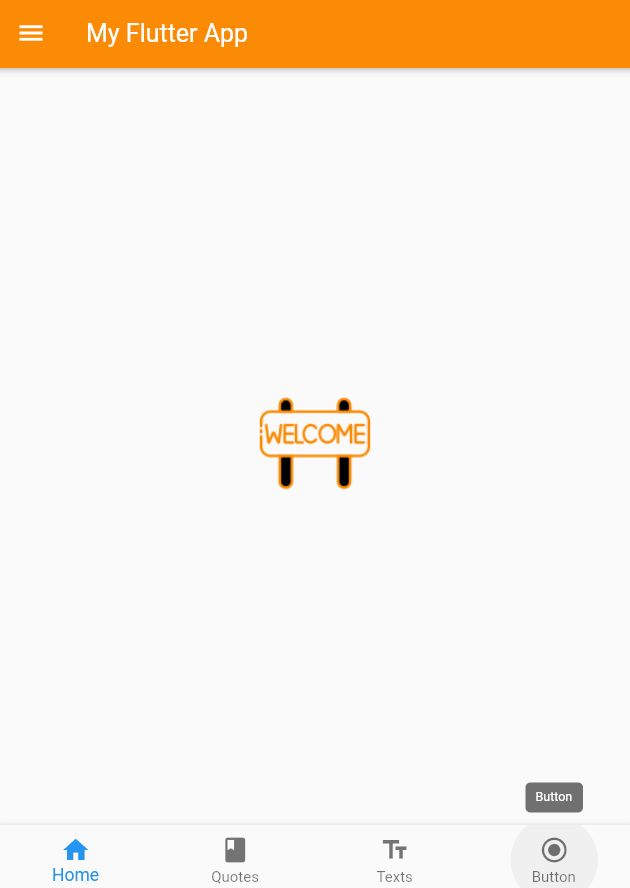
Result
If you applied your DrawerMenu Widget on the scaffold’s argument drawer, a menu button will automatically be implemented on the App bar and when you press it, the DrawerMenu that you have made will show, but you can also open the drawer menu by dragging on the left side of the screen exactly like what’s shown below.
Conclusion
I have covered how to implement a drawer menu for your Flutter app. Of course, you can design it yourself, but in my case, I made the DrawerHeader orange. On the other hand, I added an icon to my ListTile widget. The onTap argument is noteworthy, as you must implement the line of code “Navigator.pop (context)” to hide the DrawerMenu after selecting an item from the DrawerMenu. You can check the official Flutter documentation to learn about it deeply. The link will be provided below. Once again, thank you for reading. Stick with me on this Flutter journey!
https://docs.flutter.dev/cookbook/design/drawer