
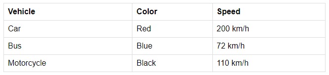
What is an HTML table?
HTML tables are composed of table cells inside rows and columns and are used to arrange data. The tag for the HMTML table is <table></table>. Tags like <td></td>, <th></th>, and <tr></tr> is also part of the HTML table.
| TAGS | DEFINITION |
<table></table> | HTML tag to create a table. |
<td></td> | HTML tag for table cells’ content. |
<th></th> | Use this HTML tag if you want the cells to be headers. |
<tr></tr> | HTML tag that stands for table row. |
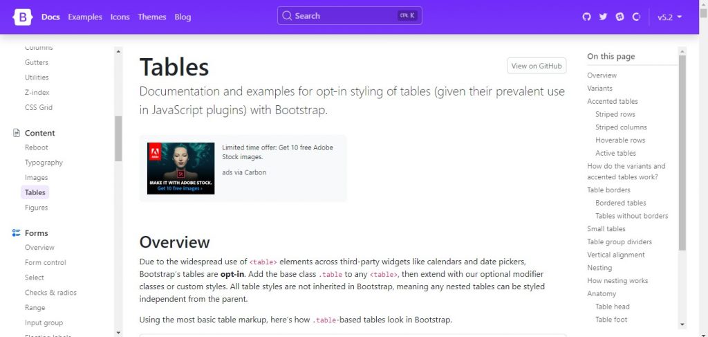
Steps in creating a basic responsive tables using bootstrap
First, open your HTML then go to the “Tables” section that is under “Content” in Bootstraps’ website.
Link: https://getbootstrap.com/docs/5.2/content/tables/
Then, scroll down and copy some codes and paste them into your HTML file.
<table class="table">
  <thead>
    <tr>
      <th scope="col">#</th>
      <th scope="col">First</th>
      <th scope="col">Last</th>
      <th scope="col">Handle</th>
    </tr>
  </thead>
  <tbody>
    <tr>
      <th scope="row">1</th>
      <td>Mark</td>
      <td>Otto</td>
      <td>@mdo</td>
    </tr>
    <tr>
      <th scope="row">2</th>
      <td>Jacob</td>
      <td>Thornton</td>
      <td>@fat</td>
    </tr>
    <tr>
      <th scope="row">3</th>
      <td colspan="2">Larry the Bird</td>
      <td>@twitter</td>
    </tr>
  </tbody>
</table>
Here’s the link of the code above: Tables · Bootstrap v5.2 (getbootstrap.com)
Make some changes to the codes and then run it.
<table class="table">
      <thead>
        <tr>
          <th scope="col">#</th>
          <th scope="col">First</th>
          <th scope="col">Last</th>
          <th scope="col">Superhero Name</th>
        </tr>
      </thead>
      <tbody>
        <tr>
          <th scope="row">1</th>
          <td>Stephen</td>
          <td>Strange</td>
          <td>Dr. Strange</td>
        </tr>
        <tr>
          <th scope="row">2</th>
          <td>Steve</td>
          <td>Rogers</td>
          <td>Captain America</td>
        </tr>
        <tr>
          <th scope="row">3</th>
          <td>Tony</td>
          <td>Stark</td>
          <td>Iron Man</td>
        </tr>
      </tbody>
    </table>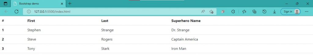
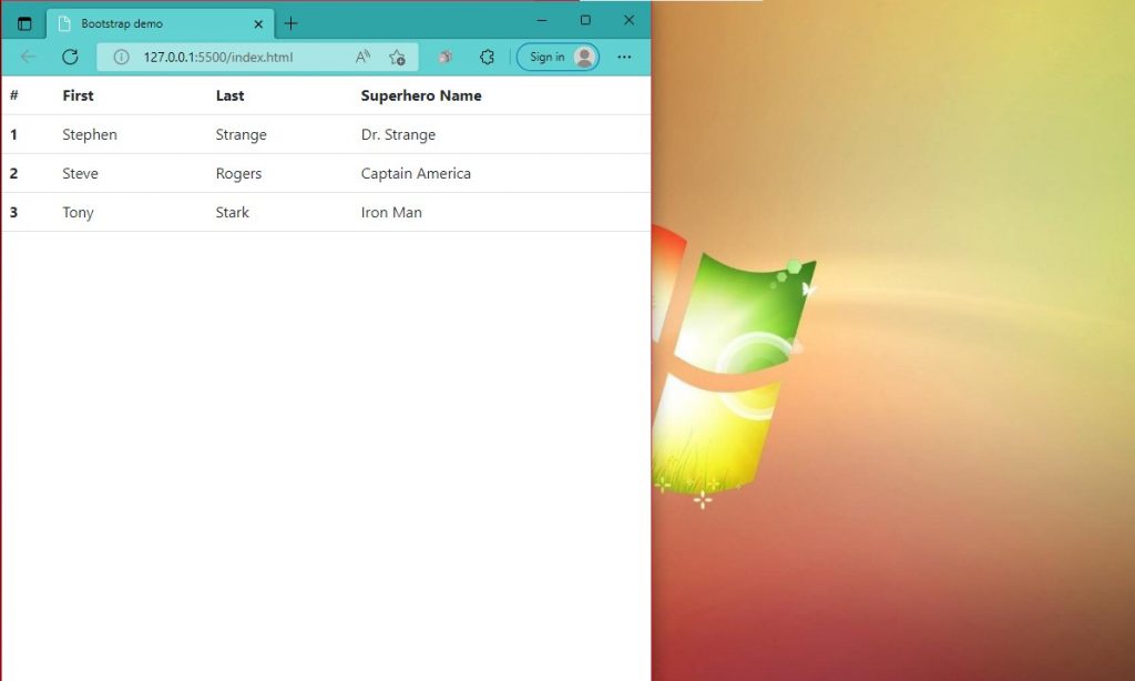
You can see above that the table is full width when the window is in full screen, but then if you shrink the window a little, you will see in the picture below the responsiveness of the table.
For more information, just go to the Bootstrap website:
https://getbootstrap.com/docs/5.2/content/tables/
I hope this was helpful. Thank you very much!