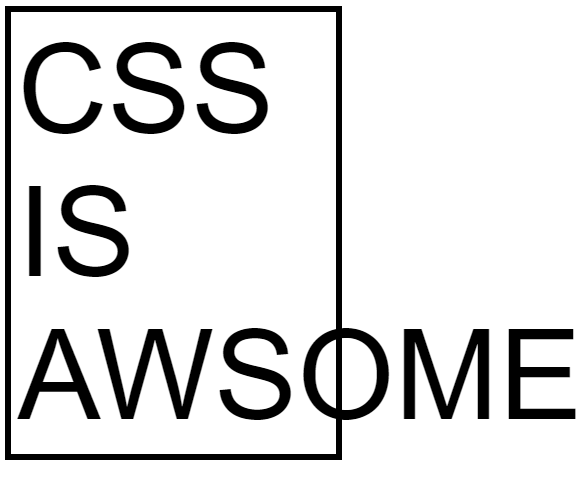
If you are a programmer you probably have seen this meme countless times. It is surely made for laughs and giggles but deep inside you, you know that the struggle when designing a website is very much real and very frustrating.
The default way of CSS is to do exactly what is shown in the meme as it would cause data loss if it was to do other things. So the consequences of this is that some of the content may go off the screen and vanish.
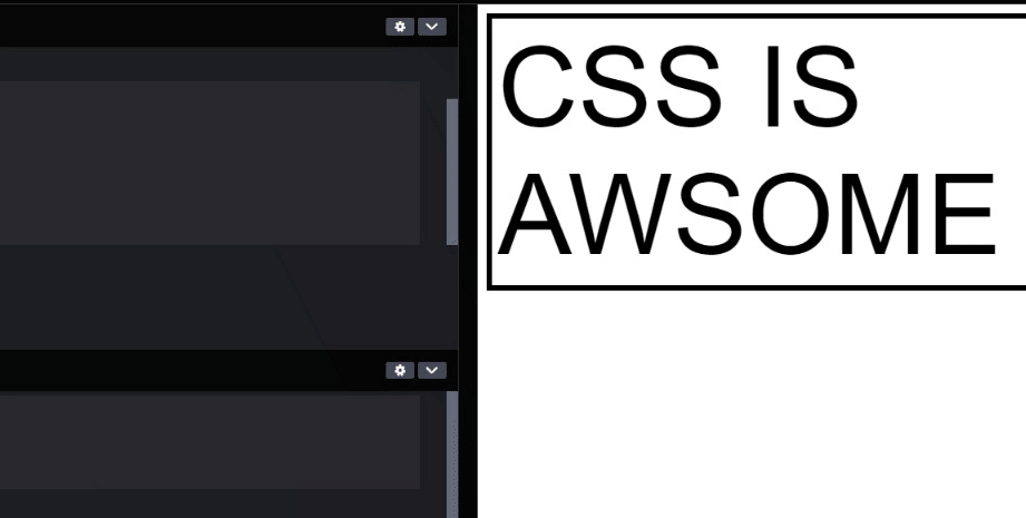
And yes, there is a CSS property that hides the overflow completely. By adding a single line of code you probably think that your problems are gone. But you see, the overflow: hidden; property only removes the items that cross the border.
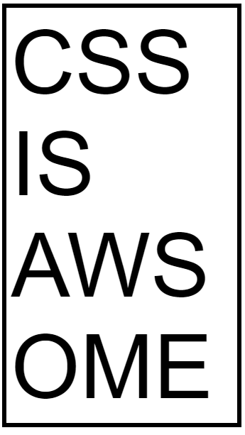
HTML code:
<body>

  <div class="p-box">
    <p>CSS IS AWSOME</p>
  </div>

</body>
CSS code:
.p-box{
  border: 5px solid;
  padding:5px;
  width: 250px;
  overflow: hidden;
}
p{
  font-size:100px;
  font-family: sans-serif;
}
And assuming that the overflowed content is important to your website, you would not want that to disappear. So here are some tips on how to deal with CSS overflow.
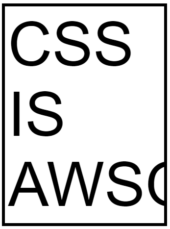
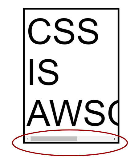
Overflow-x: scroll
.p-box{
  border: 5px solid;
  padding:5px;
  width: 250px;
  overflow-x: scroll;
}
This CSS property enables the item to have a scroll bar along the x-axis. This enables the content to be scrollable and be able to see the cut off part of the content.
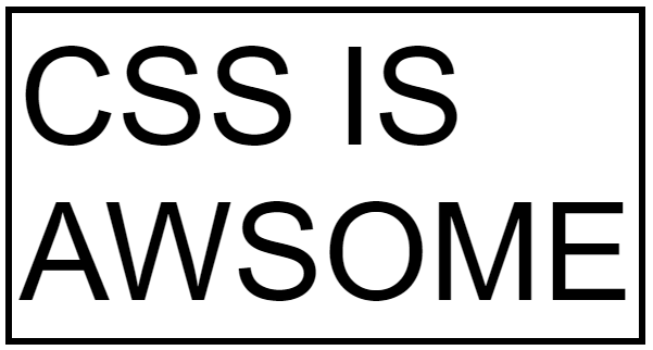
overflow-wrap: Break-word
.p-box{
  border: 5px solid;
  padding:5px;
  width: 250px;
  overflow-wrap: break-word;
}
This CSS property on the other hand, breaks the word depending on the set width of the element to avoid the overflow of item. If you want to have a responsive style you can set your width units as percent to allow the scaling of the element.
min-content
.p-box{
  border: 5px solid;
  padding:5px;
  width: min-content;
 }
min-content is a width property that sets the width of an element in this case the “div” of the paragraph based on the smallest as it can get and match the length of the largest element inside. For this case the min-content to follow is the word “AWSOME”.
fit-content
.p-box{
  border: 5px solid;
  padding:5px;
  width: fit-content;
 }
fit-content is slightly similar to min content but it allows for the element to scale up and fit to a single line and can shrink and wrap the element based on the largest element. This can be suitable if you are building a website responsive website and you have encountered an overflow issue.