
Data Visualization and Anaconda
Data visualization is a critical aspect of data analysis and data science. It helps us to understand the data, uncover patterns and relationships, and communicate insights. Today, we will learn how to use Anaconda, Pandas, and Matplotlib to create data visualizations.
Anaconda is a free and open-source distribution of the Python programming language. It includes a wide range of popular data science packages, including Pandas and Matplotlib, as well as a package manager that makes it easy to install additional packages.
Benefits of using Anaconda
Anaconda provides several benefits for data scientists and data analysts, including:
- Easy installation of packages and libraries required for data analysis and data visualization
- Access to a wide range of popular data science packages, including Pandas, Matplotlib, and more
- A user-friendly interface for managing packages and dependencies
Installation of Anaconda Distribution
Installing Anaconda is very easy and can be done by following the instructions on the official website.(https://www.anaconda.com/products/distribution)
Once installed, you can use the Anaconda Navigator to launch Jupyter Notebook, Spyder, and other data science tools.
overview of pandas and matplotlib
Pandas is a popular open-source library for data analysis and manipulation in Python. It provides data structures and functions that allow you to work with data in a flexible and intuitive way. In the following example, we will use Pandas to import and manipulate data.
Matplotlib is a plotting library for Python that provides a wide range of visualizations. It is a powerful tool for data visualization, and it can be used in combination with Pandas to create beautiful and insightful visualizations of your data.
Data Visualization using Anaconda, Pandas, and Matplotlib
In this section, we will walk through the process of using Anaconda specifically Jupyter Notebook, Pandas, and Matplotlib to create a simple data visualization.
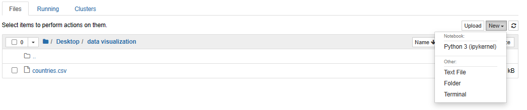
We are going to launch Anaconda and select the Jupyter Notebook.
Navigate towards the specific folder where you want to create the Python notebook. Click New and select Python 3 (ipykernel).
Importing Data using Pandas
First, we need to import the data into our Python environment. To do this, we will use the Pandas library. We will use the read_csv function to import a CSV file, but Pandas can also import data from other formats, such as Excel, JSON, and more.
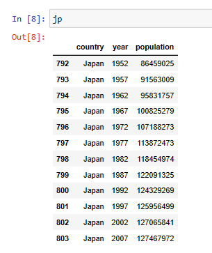
Here I will show you an example from a data file I have downloaded “countries.csv” which contains the list of countries and their population.
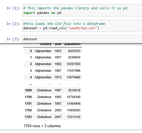
We stored the countries.csv file into a data frame called dataset and displayed it.
Visualizing Data using Matplotlib
Once we have the data imported, we can use Matplotlib to visualize it. Matplotlib provides a wide range of plotting functions that allow us to create different types of visualizations, such as line plots, bar plots, histograms, and more.
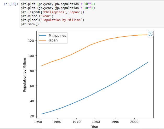
We will use the plot function from Matplotlib to create a simple line plot of our data.

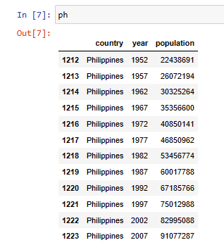
To display the visualization we will compare the population of the Philippines and Japan.

The population over the years in the Philippines.
The population over the years in Japan.
Simple line plot visualization
Let me explain each line of code:
- plt.plot (ph.year, ph.population / 10**6) – This line is creating a line plot of the data represented by the arrays population and year. The year represents the x-coordinates of the data points and the population represents the y-coordinates, divided by 10^6 to show the population in millions.
- plt.plot (jp.year, jp.population / 10**6) – This line is similar to the first line but instead of using Philippines, we used Japan.
- plt.legend([‘Philippines’,’Japan’]) – This line adds a legend to the plot to distinguish between the two plots created in the first two lines.
- plt.xlabel(‘Year’) – This line adds a label to the x-axis of the plot.
- plt.ylabel(‘Population by Million’) – This line adds a label to the y-axis of the plot.
- plt.show() – This line displays the plot on the screen.
The script creates two line plots representing the populations of Philippines and Japan over the years, with labels for the x and y-axis and a legend to distinguish between the two populations.
Conclusion
We have learned how Anaconda, Pandas, and Matplotlib are used to create data visualizations. Data visualization is a critical aspect of data analysis, and these tools make it easy to create beautiful and insightful visualizations of your data.
This is just a simple application of data visualization using Matplotlib, Pandas, and Anaconda, we will delve into more complex data visualization methods with python, such as creating dynamic visualizations with Plotly, and more advanced plotting techniques with seaborn.
These advanced visualization techniques will enable us to present data in a visually appealing and insightful manner, unlocking new ways to analyze and understand patterns and trends in data.