
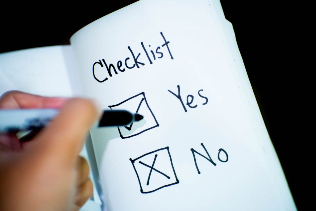
A checkbox (also known as a tickbox or tick box) is a graphical widget that allows the user to make a binary choice, that is, a choice between one of two mutually exclusive possibilities. For example, for a simple yes/no question, the user may be required to answer “yes” (checked) or “no” (not checked). Checkboxes are an integral part of the UI on all types of devices, which is why it’s important to know how to use checkboxes in flutter as a flutter developer.
In short, checkboxes let users choose one or more items from a list. Checkboxes enable or disable an option. This particular checkbox we were going to use is from Material’s UI.
Checkboxes In Flutter Usage
The use of checkboxes is to select one or more options from a list, present a list containing sub-selections, and turn an item on or off in a desktop environment. In addition, checkboxes should be used instead of switches if multiple options can be selected from a list. If a list contains numerous alternatives, avoid using switches. Use checkboxes instead. Checkboxes indicate that the items are connected and occupy less visual space.
In a similar fashion, the alternatives to checkboxes are radio buttons and switches, which can be used to enter decisions or declare preferences such as settings or dialogs.
Checkboxes can be checked, unchecked, or left unchecked. Checkboxes can be enabled, disabled, hovered, focussed, or pressed.
Source Code
The code below should have five checkboxes. The first is turned on, the second has tristate turned on, and the last is turned off.
Column(
  children: [
    for (var i = 0; i < 5; i += 1)
      Row(
        children: [
          Checkbox(
            onChanged: i == 4 ? null : (bool value) {
              setState(() {
                checked[i] = value;
              });
            },
            tristate: i == 1,
            value: checked[i],
            activeColor: Color(0xFF6200EE),
          ),
          Text(
            'Checkbox ${i + 1}',
            style: Theme.of(context).textTheme.subtitle1.copyWith(color: i == 4 ? Colors.black38 : Colors.black),
          ),
        ],
        mainAxisAlignment: MainAxisAlignment.center,
      ),
  ],
)
Checkboxes In Flutter Conclusion
We’ve learned that checkboxes let users choose one or more items from a list. Checkboxes enable or disable an option. In addition to the two options supplied by a standard checkbox, checkboxes allow for an indeterminate state. This third state is represented in the checkbox by a square or dash and signifies that it is neither checked nor unchecked. There are also alternatives to checkboxes, which are the radio buttons and switches. While implementing these in your project, sometimes there’s distraction in our workplace. That is why I also want to share how to use focus assist in windows so that you can focus on your project and achieve your project’s goals. Thank you for reading, and if you found this blog useful, please share it with your family and friends.