
In today’s mobile-first world, creating responsive applications that work seamlessly across different screen sizes and orientations is crucial. Flutter offers powerful tools to help developers build responsive UIs that adapt to various devices, from small smartphones to large tablets. This guide will walk you through the key strategies for building responsive Flutter apps.
1. Understanding Flutter’s Layout Mechanism
Before diving into responsive design, it’s essential to understand Flutter’s layout system.
- Widgets: Flutter’s UI is built using widgets. Every element is a widget, which can be composed to create complex layouts.
- Constraints: Widgets are constrained by their parent widgets. Understanding these constraints helps in designing flexible layouts.
2. Using MediaQuery for Screen Information
MediaQuery provides information about the size and orientation of the device screen.
- Screen dimensions: Use
MediaQuery.of(context).sizeto get the width and height of the screen. - Orientation: Use
MediaQuery.of(context).orientationto determine whether the device is in portrait or landscape mode.
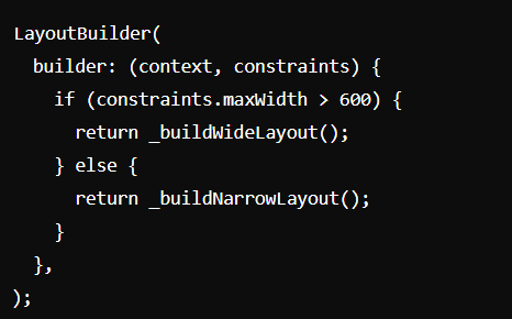
3. LayoutBuilder for Adaptive Layouts
LayoutBuilder helps build adaptive layouts that change based on the available space.
- Responsive widgets: Use
LayoutBuilderto create widgets that adapt their layout based on the parent’s constraints.
4. Flexible and Expanded Widgets
Use Flexible and Expanded widgets to create layouts that resize dynamically.
- Flexible: Allows a widget to occupy available space proportionally.
- Expanded: Forces a widget to fill the remaining space within a
Row,Column, orFlex.
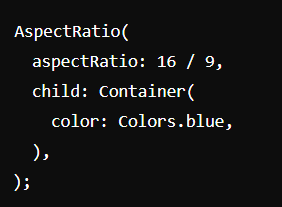
5. Using AspectRatio
AspectRatio ensures that a widget maintains a specific width-to-height ratio.
- Maintaining proportions: Use
AspectRatioto create responsive elements like videos or images that need to keep a consistent ratio.
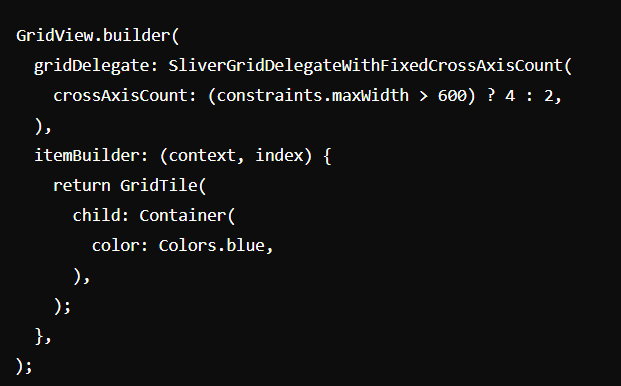
6. Responsive Design with GridView
GridView is perfect for creating responsive grid layouts.
- Dynamic grids: Use
GridViewto create grids that adjust the number of columns based on screen size.
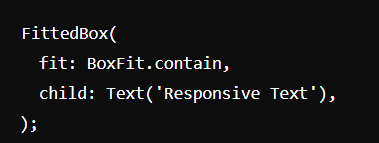
7. Using FittedBox for Scaling
FittedBox scales and positions its child within itself.
- Scaling widgets: Use
FittedBoxto ensure text and images scale properly across different screen sizes.
8. Responsive Design with Packages
Several packages can help you create responsive designs more easily.
- flutter_screenutil: Provides a set of tools to adapt UI elements for different screen sizes.
- responsive_builder: Simplifies building responsive layouts by defining different widgets for various screen sizes.
Conclusion
Building responsive Flutter applications requires a solid understanding of the framework’s layout system and the use of various tools and strategies. By leveraging MediaQuery, LayoutBuilder, Flexible, AspectRatio, and other responsive design techniques, you can create applications that provide a seamless user experience across all devices. Implement these practices to ensure your Flutter apps are versatile, user-friendly, and visually appealing on any screen size.