
Flexbox is a one-dimensional layout to design a website using CSS. It provides an easy and clean way of arranging items inside a container. This design enables the elements to be adaptive, resulting in a change in their appearance based on the type of device it is displayed. Accordingly, It allows the elements to be pliable and grants them proper placement and balance.
Notable Features of Flexbox:
- Considerable adaptability is granted.
- Organization and arrangement of elements.
- Appropriate distance between elements.
- Proper arrangement and sequence of elements.
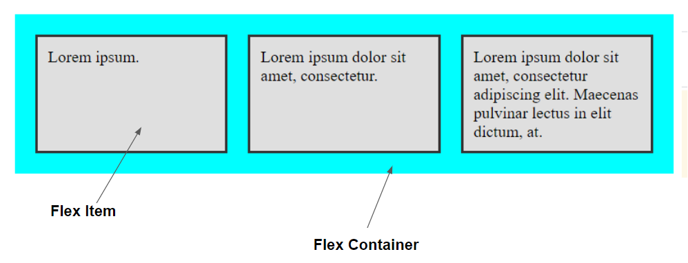
There are two main components that are present in flexbox:
The Flex Container which is the parent “div” and;
Flex Items which are the child “div ” or the items inside the Flex container.
Flexbox typically used Properties:
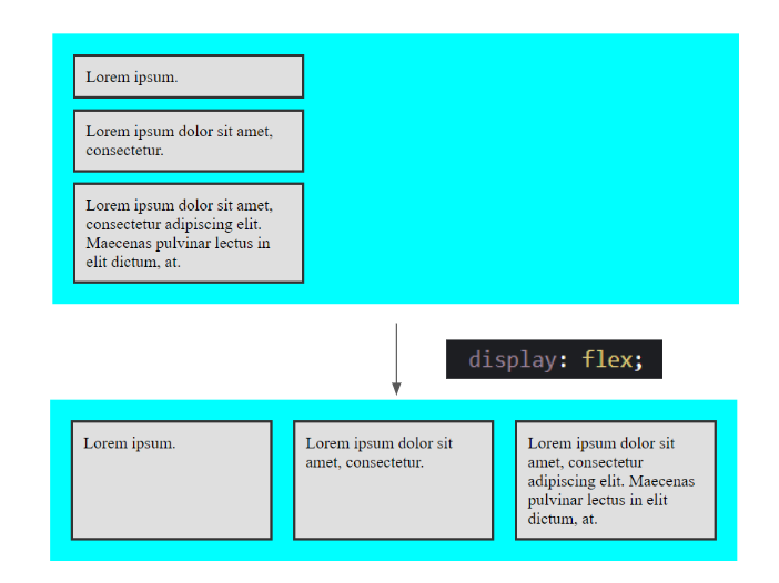
display
Displays the flex items as flexbox
.fbox-container {
  display: flex;
}
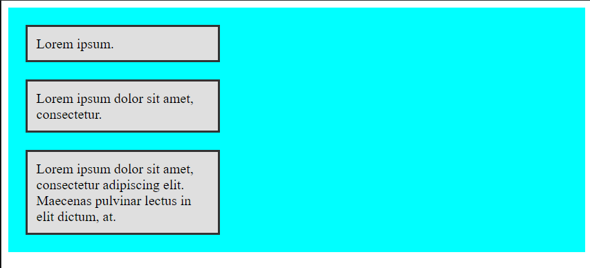
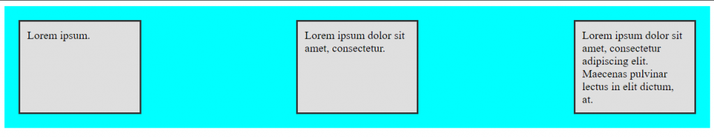
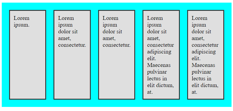
flex-direction
defines what is the direction of the items is to be oriented.
(column, row, row-reverse, column reverse)
The default direction of the items is row.
.fbox-container {
  display: flex;
  flex-direction: column;
}
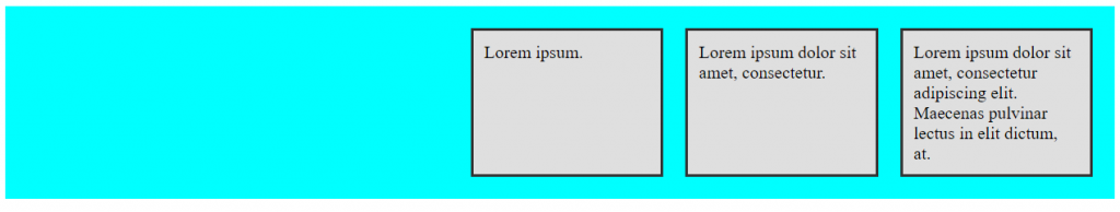
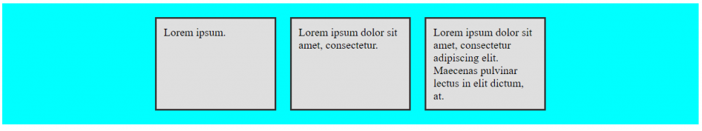
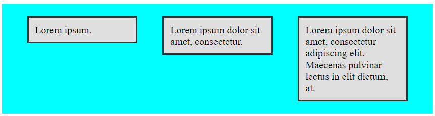
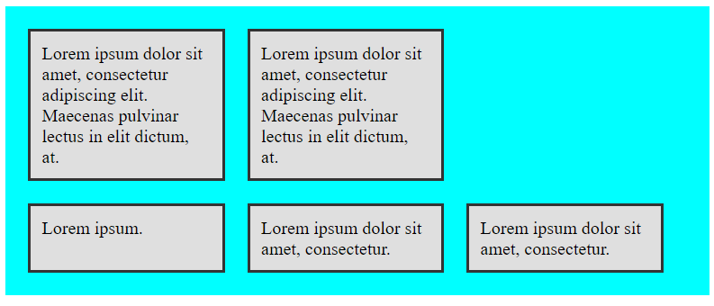
justify-content
The property aligns the items across the main-axis.
(flex-start, flex-end, center, space-between, space around, space-evenly)
flex-start is the default justification.
.fbox-container {
  display: flex;
  justify-content: space-between;
}
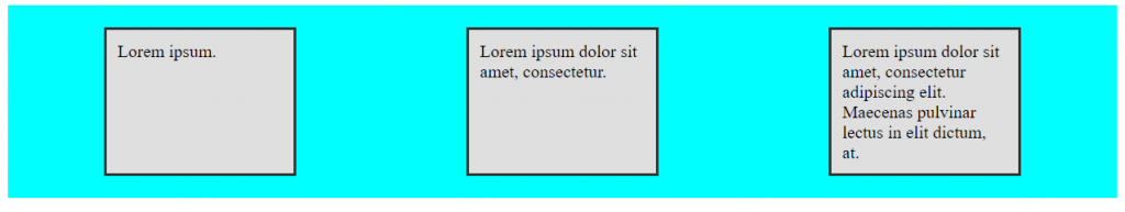
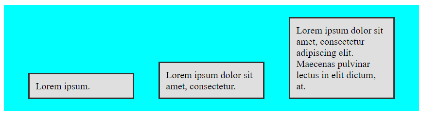
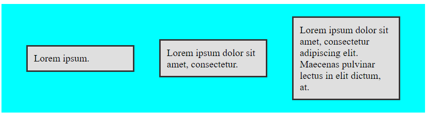
align-items
The Property aligns the items across the cross-axis
(flex-start, flex-end, center, stretch)
The default alignment is stretch.
.fbox-container {
  display: flex;
  align-items: flex-start;
}

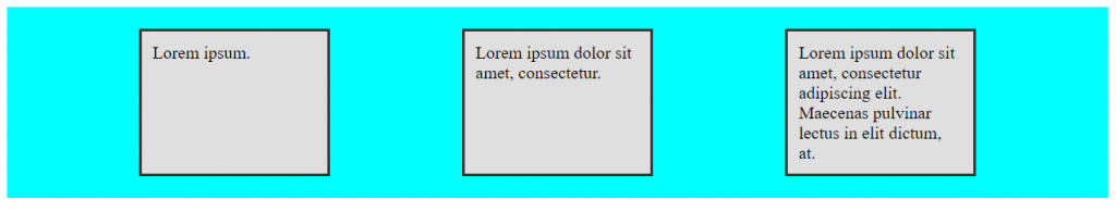
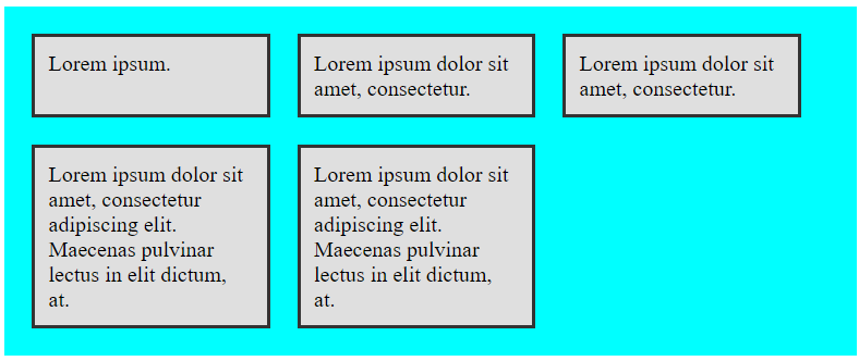
flex-wrap
The flex-wrap property enables the flex items to be forced to a one line or it can wrap onto multiple lines.
(nowrap, wrap, wrap-reverse)
the default wrap property is nowrap;
.fbox-container {
  display: flex;
  flex-wrap: wrap;
}
Conclusion
The flexbox is a dynamic and efficient layout model that evenly distributes space among elements within a container. It allows the elements to be adaptive, changing their behavior based on the type of device being used to view them. The flexbox consists of a container, referred to as the flex container, and individual elements known as items. It also has two axes, the main and cross axes, and features various properties. This article provides comprehensive information on the flexbox and includes an illustrative example.