

You might not have known what it’s called. It is text highlighted with a radius in the color of your choice. It is called the “badge.” I, too, never knew what it was called until I read it in one of the JavaScript UI Frameworks. Today I am going to demonstrate how to add a badge in Flutter. Let’s get started!
It wasn’t part of the pre-features of Flutter, which is why we needed a package to implement it. It’s a good thing the community of Flutter provides us with the Badge feature.
Badges Package
Introducing badges. This flutter package can be installed by going to pub.dev and searching for “badges”. It is quite easy to install; just add the dependencies and import them into your dart file.
Here’s the link where you can access the package: https://pub.dev/packages/badges you can also check their readme tab and check their cool badges.
To install it, first I must go to the “Installing” tab on the webpage I gave you above. Next is to go to your project in your Visual Studio Code where you want to implement it and then find and open its pubspec.yaml file. Furthermore, in my case, at the time I wrote this blog, the current version was 2.0.2. To conclude, I must write this snippet of code to the pubspec.yaml file.
dependencies:
  badges: ^2.0.2
Again, don’t forget to import it too.
Application
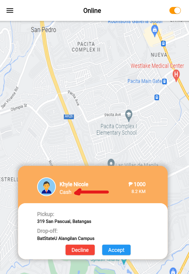
Now I have a project that requires me to use badges. See the image below. I need to make the “Cash” text have a highlight on it and also have rounded corners.
Now to implement it, I must first insert the dependencies on the pubspec.yaml file exactly as I demonstrated above and import it into my project. Don’t forget to flutter pub get to apply the dependencies to your project.
Afterwards, I am going to use the badge widget. Some of its arguments are not required but need to be addressed, like the “toAnimate” argument. By default it is set to “true”. It is critical to set it to “false” because we’re not going to use animation in it for now. Next was the “shape” argument. In my case, I had to set it to “square” because by default it is set to “circle.” Next was the “badgeColor.” I’m going to set it to “white” and then on the argument “borderRadius”, I have to set it to “circular” with a radius of 9. Finally, the “badgeContent” is where I have to set my text widget.
import 'package:badges/badges.dart'; // import this
...
Badge(
toAnimate: false,
shape: BadgeShape.square,
badgeColor: Colors.white,
borderRadius: BorderRadius.circular(9),
badgeContent: Text(
widget.paymenttype,
style: const TextStyle(
color: const Color(0xFFfbac5c),
fontSize: 13,
),
textAlign: TextAlign.start,
),
),
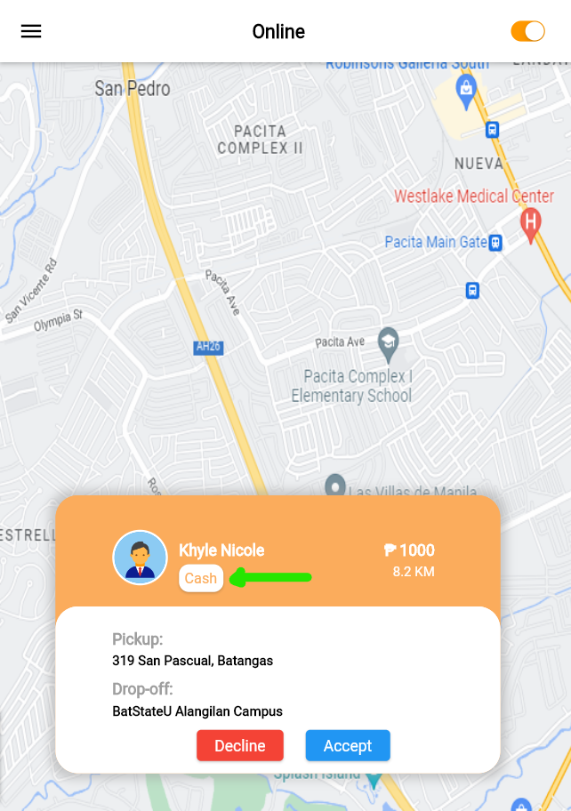
...The result is shown below:
Conclusion
We discovered that a Text with a highlighted color that has a border is called a “Badge” and since Flutter doesn’t have it as of now, we utilized the community by using the existing package created by the community. The Badge widget installation was easy by inserting the dependency on the pubspec.yaml and importing the package into our project. Additionally, the widget has an argument that isn’t required but still needs to be addressed. Thank you for following me on this Flutter journey. Keep reading and once again, thank you!