
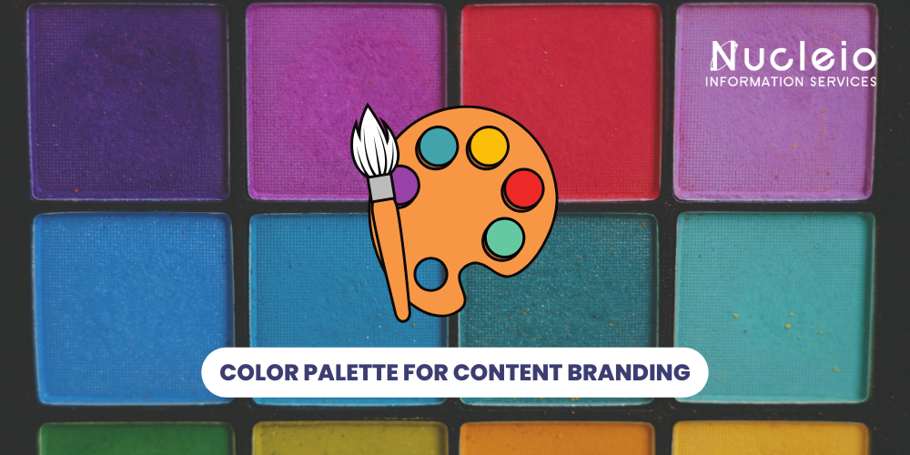
Your brand’s color palette is an important aspect to your brand. It’s splashed across your website, emails, business cards, logo, and more, making a lasting impression on potential customers. Choosing the right colors, through strategic color palette for content branding, is crucial for establishing a strong brand identity and fostering a connection with your target audience.
Why Color Palette Branding Matters
Color significantly impacts brand recognition. Studies show it can increase brand recognition by up to 80% and is a major reason why people choose to buy! Your colors also play a significant role in how your brand personality is perceived. So, it’s vital to select memorable and recognizable colors to attract and retain customers.
How to Choose Your Brand Colors
Consider the Mood You Want to Convey: Is your brand professional or easy-going? Quirky or traditional? Fun or functional? Do you want to evoke a sense of calm or energy? Reflecting on these questions will guide your color selection.
Picking Your Palette: You can create a balanced palette using two or three colors. Here are some popular options:
- Complementary Colors: These sit opposite each other on the color wheel, like red and green, purple and yellow, or blue and orange. They create a vibrant and eye-catching effect.
- Split-Complementary: Choose a color and the two colors on either side of its complement. This offers a bit more balance than a straight complementary scheme.
- Monochromatic: Select one color and use it in a variety of tones, tints, and saturations. This creates a clean and sophisticated look.
The Psychology of Color in Branding
Understanding the emotions linked to different colors empowers you to craft a targeted message:
- Red: Bold and attention-grabbing, associated with energy, passion, and excitement.
- Orange: Cheerful, optimistic, and stimulating, often linked to creativity and fun.
- Yellow: Evokes happiness, optimism, and warmth. A great choice for creating a positive and lighthearted connection.
- Green: Represents freshness, health, and vitality. Creates a connection to nature and signifies growth.
- Blue: A symbol of trust, security, and professionalism. Popular across many industries for its calming and dependable feel.
- Purple: Combines the energy of red with the stability of blue. Often associated with luxury, creativity, and mystery.
- Black: Exudes sophistication, power, and elegance. Can also be seen as serious or dark.
- White: Represents simplicity, purity, and cleanliness. Commonly used by companies associated with nature, children, and healthcare.
Choosing Your Brand Colors: A Step-by-Step Guide
- Identify Your Brand Identity: What are your brand’s core values and personality traits?
- Consider Your Target Audience: Who are you trying to reach, and what emotions do you want to evoke in them?
- Research Color Meanings: Learn how different colors are perceived in various cultures.
- Explore Color Schemes: Use online tools like Adobe Color to experiment with different color combinations.
- Test and Refine: Get feedback on your color palette from your target audience and make adjustments as needed.
Conclusion
Your color palette is an essential element of your brand identity. By understanding the psychology of color and carefully considering your brand’s unique personality and target audience, you can craft a winning color palette for content branding that resonates with your customers and leaves a lasting impression. Remember, a well-chosen color palette can elevate your content and establish a strong brand presence across all your marketing materials.